
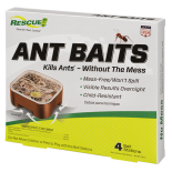
 Ant Baits
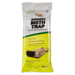 Birdseed Moth Trap
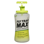 Fly Trap Max
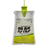 Fly Trap, Big Bag
 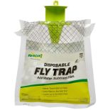 Fly Trap, Disposable
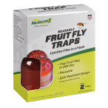 Fly Trap, Fruit Fly
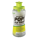 Fly Trap, POP! Fly
 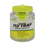 Fly Trap, Reusable
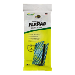 FlyPad
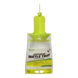 Japanese Beetle Trap
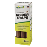 Spider Trap
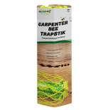 TrapStik, Carpenter Bee
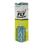 TrapStik, Deck & Patio Fly
 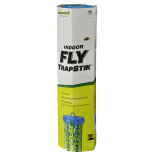 TrapStik, Indoor Fly
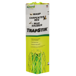 TrapStik, Wasp
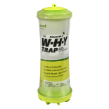 W·H·Y Trap for Wasps, Hornets & Yellowjackets
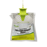 Yellowjacket Trap, Disposable
 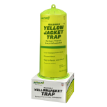 Yellowjacket Trap, Reusable
, we asked Alyssa to describe her role at RESCUE! and what goes into packaging each insect trap, repellent, bait station and refill.
Once RESCUE! has a new product we want to bring to market, what's your approach to packaging it?
First I consider the structural design of the packaging. We also want to grab the consumer’s eye on the shelf while keeping costs reasonable -- which can be challenging. We don’t have the fat margins or high price points of big-ticket items, so we must get creative to stand out on the shelf with minimal cost. Our WHY® Trap and TrapStik® line do this well, showing off the unique design, quality manufacturing and pleasing colors of the item without putting them in a box. Don’t get me wrong, boxes have their place in the RESCUE! product line and make sense for many items -- but when we can, we like to think outside the actual box!
What are the top considerations that go into designing the package for each RESCUE! product?
Packaging should be a reflection of our company and brand. When the consumer has that first interaction with a RESCUE! product, we want to make a good impression. We’re all about quality products that are easy to use and environmentally sound, so our packaging needs to show off the product, be easy to open and use sustainable materials or minimal waste. For these reasons, our packaging uses a cutout window or a full color image to easily see the innovative design and eye-pleasing product inside. We also make sure it's easy to open and deploy so you can get on with your day. And we strive to keep wrapping and “extra” packaging to a minimum, and use materials that are recyclable. Many of our reusable traps are not even housed in traditional packaging; they sit on the shelf showing just how they will look in a backyard.
Aside from RESCUE! packaging, what are some other products whose packaging design/graphics grab you?
The Fridababy product line. The packing is clean, uncluttered, and uses the product name and a cute illustration to quickly explain what each product is/does. I’m a new mom and I need to know not only what the product is, but why I need to buy it. Fridababy accomplishes both needs with just the product name and a cute, simple illustration.
Have you ever tried a new product based solely on what the packaging looks like? What was it?
I absolutely judge a book by its cover! I’m a sucker for a bright and cheery color palette, so my eyes did the shopping with Munchkin sippy cups and Boon Squirt baby food dispenser. (Have I mentioned that I’m new to motherhood?)
)
We all know that first impressions matter when meeting people. They also matter greatly when faced with choices at the retail shelf -- so naturally, packaging is a crucial factor in selecting what you buy. In fact, some studies say that one-third of consumer decision-making is based on packaging,
.jpg) When you see a RESCUE! product on the shelf, you may not realize how much attention has been given to how it looks and what packaging surrounds it. For RESCUE! Brand Manager Alyssa Ando, smart package design is always at her top of mind.
When you see a RESCUE! product on the shelf, you may not realize how much attention has been given to how it looks and what packaging surrounds it. For RESCUE! Brand Manager Alyssa Ando, smart package design is always at her top of mind.
Recognizing that today is National Package Design Day (yes, it's a thing!), we asked Alyssa to describe her role at RESCUE! and what goes into packaging each insect trap, repellent, bait station and refill.
Once RESCUE! has a new product we want to bring to market, what's your approach to packaging it?
First I consider the structural design of the packaging. We also want to grab the consumer’s eye on the shelf while keeping costs reasonable -- which can be challenging. We don’t have the fat margins or high price points of big-ticket items, so we must get creative to stand out on the shelf with minimal cost. Our WHY® Trap and TrapStik® line do this well, showing off the unique design, quality manufacturing and pleasing colors of the item without putting them in a box. Don’t get me wrong, boxes have their place in the RESCUE! product line and make sense for many items -- but when we can, we like to think outside the actual box!
What are the top considerations that go into designing the package for each RESCUE! product?
Packaging should be a reflection of our company and brand. When the consumer has that first interaction with a RESCUE! product, we want to make a good impression. We’re all about quality products that are easy to use and environmentally sound, so our packaging needs to show off the product, be easy to open and use sustainable materials or minimal waste. For these reasons, our packaging uses a cutout window or a full color image to easily see the innovative design and eye-pleasing product inside. We also make sure it's easy to open and deploy so you can get on with your day. And we strive to keep wrapping and “extra” packaging to a minimum, and use materials that are recyclable. Many of our reusable traps are not even housed in traditional packaging; they sit on the shelf showing just how they will look in a backyard.
Aside from RESCUE! packaging, what are some other products whose packaging design/graphics grab you?
The Fridababy product line. The packing is clean, uncluttered, and uses the product name and a cute illustration to quickly explain what each product is/does. I’m a new mom and I need to know not only what the product is, but why I need to buy it. Fridababy accomplishes both needs with just the product name and a cute, simple illustration.
Have you ever tried a new product based solely on what the packaging looks like? What was it?
I absolutely judge a book by its cover! I’m a sucker for a bright and cheery color palette, so my eyes did the shopping with Munchkin sippy cups and Boon Squirt baby food dispenser. (Have I mentioned that I’m new to motherhood?)