Founding Sterling International in 1982, owner Rod Schneidmiller pioneered the insect trap category at a time when harsh chemical pesticide sprays were the norm. We adopted the brand name RESCUE! in the late 1980s, providing a contrast to competing insect control brands which used negative-sounding names, death imagery, and an abundance of black on their packaging.
.png) Now wrapping up our 35th year, we're driving home the environmentally-responsible and American-made quality message of RESCUE! by unveiling a fresh new look for our products. The new packaging is being rolled out to stores this month.
Now wrapping up our 35th year, we're driving home the environmentally-responsible and American-made quality message of RESCUE! by unveiling a fresh new look for our products. The new packaging is being rolled out to stores this month.
Earlier this year, we awarded our packaging design and positioning business to Swanson·Russell in Nebraska, an agency that has worked with some of the biggest names in the lawn & garden category.
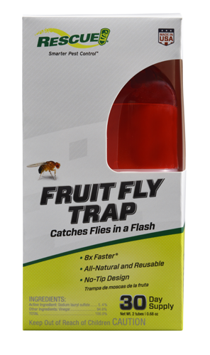 The updated packaging features a clean, consistent look and pithy product points that reflect the tone and style of the RESCUE! brand, as well as the quality. Designed with the total customer experience in mind, the package also clearly states the solution RESCUE! offers and the key benefits of the product.
“A great customer experience starts when the consumer, standing in the aisle, can quickly identify the solution to their insect problem,” explains Jim Oxley, Vice President of Sales & Marketing for RESCUE!. “With our new packaging, this takes only a few seconds."
“A great customer experience is complete,” he continues, “when the RESCUE! product they purchased works better on bugs than anything they’ve used previously. Our goals are packaging aimed simply at problem/solution propositions; products designed to exceed previous experience; and rave reviews for retailers and RESCUE!.”
In a busy, visually agitated category, the Swanson·Russell-designed packaging imparts visual and auditory calm with a whitish-grey background and judicious use of “negative space”.
Included are the trademark neon-like “RESCUE! green” color, a single image of the targeted insect, an attractive illustration of the product, and the “Made in USA” icon.
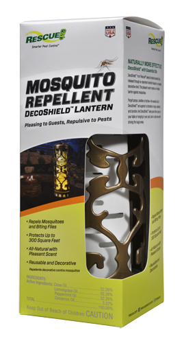 Multiple focus groups, held in 2016 with consumers who purchased household insect control products, told a significant story of how the packaging would be received by the public. Comments indicated that the new RESCUE! look stood out from the rest of the pack because it “makes the product appear more natural and less ‘chemical’”.
Participants also noted that RESCUE!’s new packaging presented a message of “environmentally safe”, “home-friendly” and “professional”. While the competitor products had a “big industrial killing look” and “screamed poison”, the RESCUE! package stood out because it looked “clean and easy to read”, “less scary” and “more natural”.
The first products appearing on shelves with the new treatment are the TrapStik® for Flies, Fruit Fly Trap, Spider Trap and the forthcoming Pantry & Birdseed Moth Trap.
What do you think of our new look? Drop us a line to let us know!

 Ant Baits
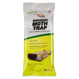 Birdseed Moth Trap
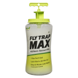 Fly Trap Max
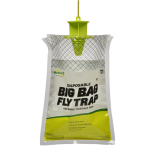 Fly Trap, Big Bag
 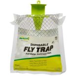 Fly Trap, Disposable
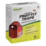 Fly Trap, Fruit Fly
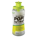 Fly Trap, POP! Fly
 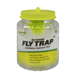 Fly Trap, Reusable
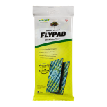 FlyPad
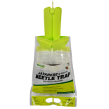 Japanese & Oriental Beetle Trap
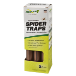 Spider Trap
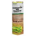 TrapStik, Carpenter Bee
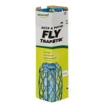 TrapStik, Deck & Patio Fly
 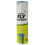 TrapStik, Indoor Fly
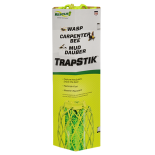 TrapStik, Wasp
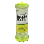 W·H·Y Trap for Wasps, Hornets & Yellowjackets
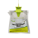 Yellowjacket Trap, Disposable
 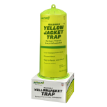 Yellowjacket Trap, Reusable
  Ants
Ants Biting Flies
 Carpenter Bees
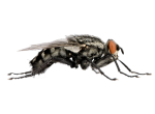 Flies
Flies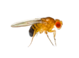 Fruit Flies
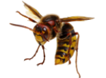 Hornets
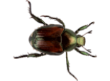 Japanese Beetles
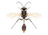 Mud Daubers
 Oriental Beetles
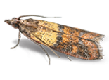 Birdseed & Pantry Moths
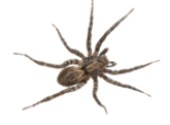 Spiders
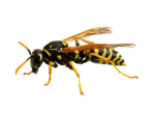 Wasps
Wasps Yellowjackets